


secrets of countries happier than ours
Manila, 1 March—We were so thrilled to find out that our entry to last month’s World Data Visualization Prize made it to this long list at Information is Beautiful—frankly a dream come true for me, a data visualization nerd and newbie.
Just a bit of background on the contest: We got wind of the competition earlier this year, close to the deadline, so this was a bit of a cram. It was open to everyone interested in information design and storytelling, but was not exclusively geared toward creative professionals or designers. There were cash prizes, and a shot at having our submission showcased to government leaders at the World Government Summit, but these were far from our mind; we just wanted to try putting together something for this in particular as a personal challenge.
The theme this year focused on how governments are improving citizens' lives. This included innovations that drive and measure success in this area, and a host of other factors such as environment, happiness, employment, technology, agriculture or any other area of government support.
Participants could choose any one (or visualize all three!) competition concepts:
The Future Of Government | Forces and technologies that will shape and influence governance and society to 2030 and beyond. Visualize future innovations and developments, taking us through the storyline to get there.
What Makes A "Good" Government? | What powers successful governments? How is that success measured? Dive into this detailed dataset of indicators and find the correlations, comparisons and stories you can tease out.
Smaller? Better? More Productive? | Nations vary in shapes and sizes, but all of them tell compelling stories. What interesting trends and discoveries can you reveal about various countries around the world?
What about the data? Datasets were provided per concept. The sample datasets could be downloaded here.
We looked at the datasets and decided to go with the second concept, “What Makes A ‘Good’ Government?”, which we also thought was quite relevant to our local context, because of course we wanted to tell a story about the Philippines.
The spreadsheet for that was a bit… challenging.

It had more than 30 columns each for all 195 countries. The data available ranged from population counts, GDP per capita and surface areas of countries, to human development index scores and health expenditure data, to name a few.
To find the story, we decided to look for the starting point. We eventually decided to anchor the story on something very Filipino: Happiness.
So we took the World Happiness Report Score as our anchor column, and chose a handful of other metrics to figure out how the ‘happiest’ countries fared in terms of the following:
Health expenditure as a percentage of GDP, as recorded by World Bank
Human development index score, as recorded by the UN Development Programme. This is defined as “a summary measure of average achievement in key dimensions of human development: a long and healthy life, being knowledgeable and have a decent standard of living.”
Government integrity, as measured by Washington think-tank The Heritage Foundation in its Index of Economic Freedom
Judicial effectiveness, as measured by Heritage Foundation
Overall economic freedom, as measured by Heritage Foundation
Political and civil liberties scores, as monitored by Freedom House in their Freedom in the World report (Methodology here). A country or territory is assigned two ratings—one for political rights and one for civil liberties—based on its total scores for the political rights and civil liberties questions. Ratings range from 1 to 7, with 1 representing the greatest degree of freedom and 7 the smallest degree of freedom.
Political stability and absence of violence, as tracked by World Bank
Government effectiveness, as tracked by World Bank
Rule of Law, as tracked by World Bank
Control of corruption, as tracked by World Bank
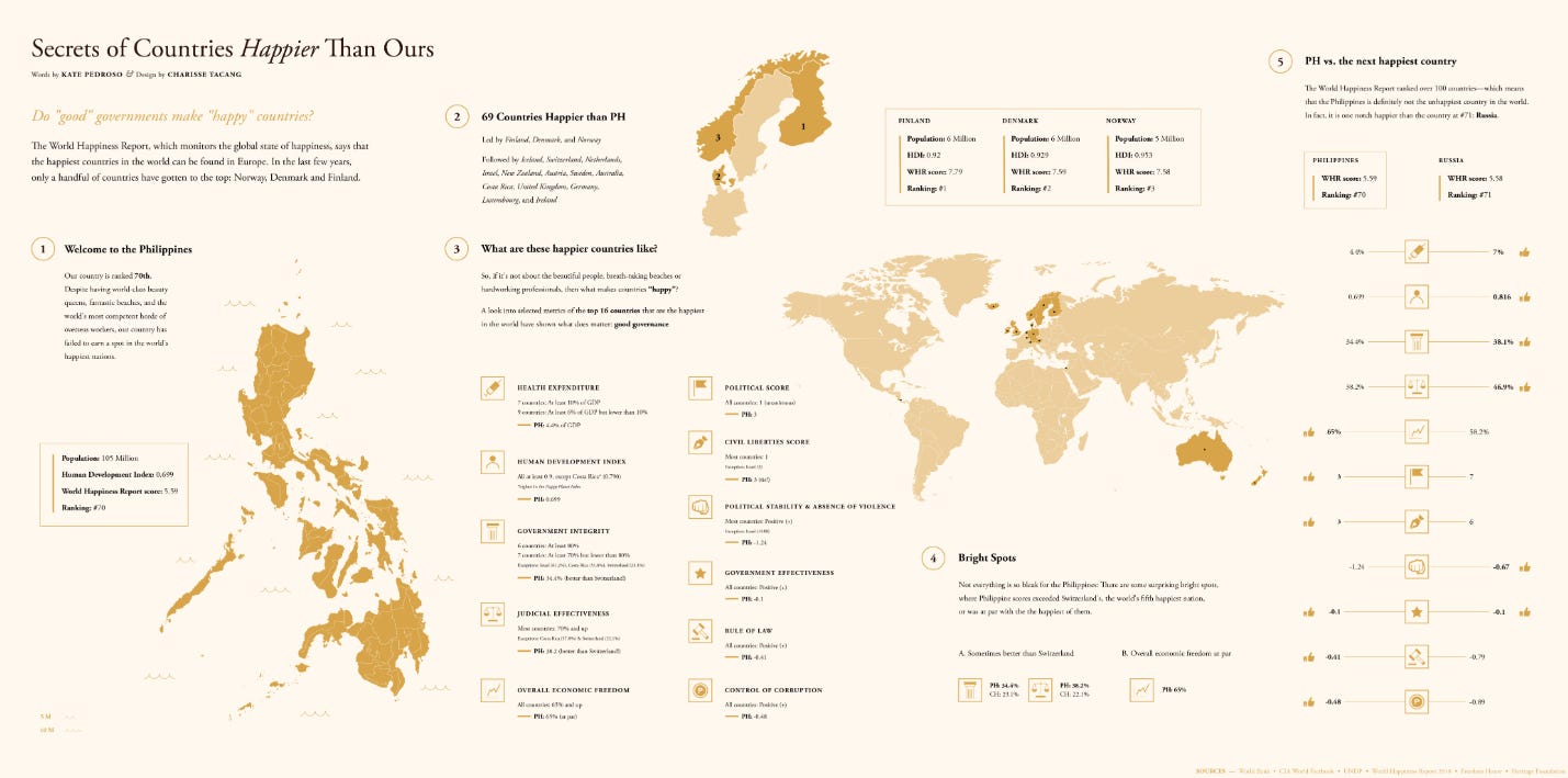
So this was a bit of a handful, but already looking at how the figures stacked against one another, we already had a pretty good storyline forming for us. When we ranked the countries according to their World Happiness Report scores, we found that, with the Philippines ranking 70th, there were 69 other countries “happier” than PH. Which begged the question: What is it like in those countries, as far as these other metrics were concerned?
To manage the sheer amount of data, I resorted to color-coding country scores to help me view patterns better.

I assigned colors to score ranges—the lighter, the better the performance. In this snippet for example, I arranged by HDI scores, and assigned the lightest shade of yellow to HDI scores of 0.9 and better. Already we can see that the top-most countries (Norway, Switzerland, Australia for instance) also had high World Happiness Report Scores, as well as good political rights and civil liberty scores (except Singapore).
This mode of analysis also allowed for interesting blips of stories to emerge, such as Switzerland’s government integrity score which was much lower than other relatively happy nations. You could also see Asian countries like Singapore, Japan and South Korea lag a bit in terms of World Happiness scores, alongside US. Interesting.
However, at this point, the amount of data was still unwieldy. So we decided to take a snapshot of the world’s Top 16 happiest countries and go from there. All these countries scored more than 7.0 in the World Happiness Report, which found that countries that topped this study also ranked highly on factors that supported happiness, such as caring, freedom, generosity, honesty, health, income, and good governance.

From this data set, we came up with the summary chart of the metrics, and compared the performance of the Philippines vs. the Top 16 (Part 3 of infographic). Once this core story was established, it was easy to construct the flow of the rest of the storytelling:
We figured we wanted to start with the Philippines, so that was the entry point of our infographic: The Philippine map, and relevant information.
We also made sure to highlight the performance of the Top 3 countries for easy reference, and plot the rest of the Top 16 countries on the world map.
We dedicated a special portion to highlight the things that were going right for the Philippines in comparison to the world’s happiest nations (under Part 4, Bright spots); and
Lastly, we thought it would be a good closing dataset if we compared the Philippines, ranked 70th, to the next happiest country—which happened to be Russia, occupying #71 in the World Happiness Report.
I then summarized all the information into easily digestible and translatable chunks, also in Excel. I needed something that was easier on the eye and less panic-inducing than my rainbow-colored original spreadsheets. This next spreadsheet was built specifically for the designer and already contained a bit of copy.

At this point, I’d also like to share my initial sketch of the infographic, if only to highlight just how much work the designer needed to do for this infographic to happen (hehe)
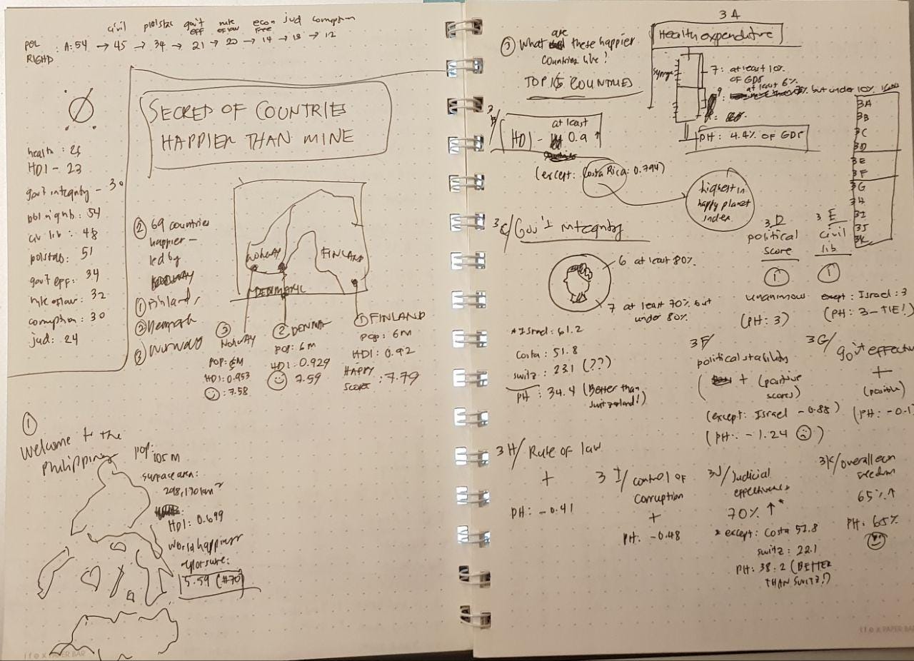
Truth be told, I’m still amazed whenever I think about how this messy concept and all those overwhelming details in all those spreadsheets eventually turned into the neat, easy-to-read, professional-looking infographic that they ended up being folded into. For me, that’s what truly made this project beautiful.
And on that note—thank you, World Dataviz Prize and Information is Beautiful for hosting this competition and challenging us to do something like this! Looking forward to joining the next ones (as well as to get our friends to join as well!)
—
Do you need a designer? Check out Cha’s other data visualization works here.
Get in touch with her for possible tie-ups and collaborations here.